The Riddler — Can You Slay The Puzzle Of The Monsters’ Gems?
The Riddler — Can You Solve This Elevator Button Puzzle?
The Riddler — Perplexing Puzzle of the Proud Partygoers
Project
The Riddler is a weekly puzzle series from Oliver Roeder at FiveThirtyEight that usually involves some combination of math, logic and probability.
This weeks FiveThirtyEight Riddler, The Perplexing Puzzle of the Proud Partygoers was:
It’s Friday and that means it’s party time! A group of N people are in attendance at your shindig, some of whom are friends with each other. (Let’s assume friendship is symmetric — if person A is friends with person B, then B is friends with A.) Suppose that everyone has at least one friend at the party, and that a person is “proud” if her number of friends is strictly larger than the average number of friends that her own friends have. (A competitive lot, your guests.)
Importantly, more than one person can be proud. How large can the share of proud people at the party be?
The question lends itself to Graph Theory, so I started with a random 20 node (which present partygoers) network.
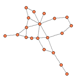
The above shows a simple graph that could represent a party. The orange nodes represent the partygoers, and the gray lines (edges) represent the other partygoers each person is friends with.
Since the condition of the problem is that every partygoer has at least one friend there, we’re dealing with a connected graph — every node is connected to at least one other. The minimum and maximum number of edges for a connected graph with N edges is:
Min Edges = N‑1
Max Edges = (N*(N‑1))/2
The first thing I did was generate a random graph for every possible edge condition for a 25 node graph (from 24 edges to 300 edges), and calculated the proportion of proud partygoers at each graph. This generated the following (presented in FiveThirtyEight style!):
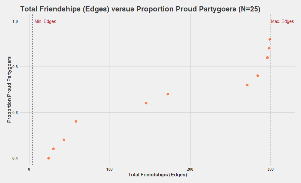
I only plotted values in which the proportion of proud partygoers increased, and saw it peaked right before the maximum amount of edges (300). The peak value occurred at 299 edges. At the maximum edge amount, the proportion of proud partygoers fell to 0.
The next step was to see whether this trend held through for graphs with node amounts different than 25. I ran a similar script to the one above for varying amounts of partygoers, and recorded the edges at which the Proportion of Proud Partygoers theme was at a maximum.
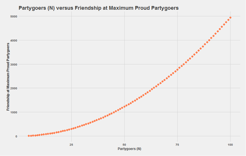
What immediately stands out is that the data mirrors a quadratic, and looks very similar to the maximum edges formula earlier. Some selected data from the above chart is below:
| Partygoers (N) | Friendships (edgeS) at Max Proud Partygoer Proportion |
|---|---|
| 5 | 9.00 |
| 10 | 44.00 |
| 20 | 189.00 |
| 40 | 779.00 |
| 50 | 1224.00 |
| 100 | 4949.00 |
Taking a closer look at that data, and recalling that proportion of proud partygoers fell to 0 at the maximum edge value at N=25, you can conclude the number of edges at which proud partygoer proportion is maximized is:
Edges @ Max Partygoer Proportion = Max Edges ‑1 = (N*(N*1))/2
One less than the maximum number of edges.
So now that we know the makeup of a graph (in terms of # of edges/nodes) that maximizes proportion of proud partygoers, I graphed what that proportion is for a given number of partygoers (N).
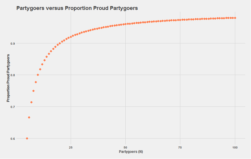
The data looks similar to a f(x) = (x‑1)/x function where the function will approach, but never be greater than 1 — which is intuitively in line with the problem; the proportion of proud partygoers won’t even be greater than the amount of partygoers.
For N=5 the maximum proportion of partygoers is 0.6. For which the network graph looks like:
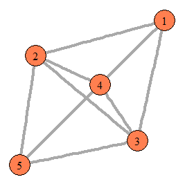
3/5 of the nodes are directly connected to every other node in the graph, while 2/5 are only connected to 3 of the other nodes. Given that our graph has 1 less edge than the maximum number of edges, it makes sense that 2/N nodes would no longer be fully connected. Therefore in a graph of size N with [Max Edges — 1] Edges, the amount of proud partygoers would be N‑2.
| Partygoers | Max Proportion Proud Partygoers |
|---|---|
| 5.00 | 0.60 |
| 10.00 | 0.80 |
| 20.00 | 0.90 |
| 40.00 | 0.95 |
| 50.00 | 0.96 |
| 100.00 | 0.98 |
Testing that theory against some of the data holds true. Therefore we conclude that the proportion of proud neighbors for a given party of N people is:
Prop. of Proud Partygoers = (N‑2)/N
Gauging Media Preseason Projections
Democratic Search Data/Delegate Counts
Team Assist Matrix Visualization
Project Focus:
Data Visualization • Data Analysis • R
Project Overview
I noticed that NBA teams create offense in very different ways (as measured by assists) — for examples most of the LA Clippers offense comes through Chris Paul whereas the San Antonio Spurs take a very different approach. Consequently, I wanted to create a visualization that gave a quick snapshot of team’s offenses were run.
Methodology
I scraped the data off the NBA’s individual player Pass Dashboards. From there I used R to wrangle the data so that I could export it to the heatmaps seen below. Finally, I created a Shiny application so users can easily access the data.
Below is a Shiny/RStudio app for assist visualizations of individual NBA teams. The heatmap [should] be self-explanatory — it shows which players assist others on a given team.
The Github code can be found here.
Project
Notes
- Assists are not normalized by games or minutes played. Consequently, the visualization favors high MPG players and non-injured players.
- Utah’s map is probably my favorite one. It’s really cool to see how many different ways they initiate the offense, while maintaining a league average ORtg.
- While I wish the Lakers nothing but failure, the DLo/Clarkson/Randle love is cool to see. The Nick Young/Bass connection is also too strong. It’ll be interesting to see how DLo’s assist relationship with his teammates changes in light of recent news (only half kidding).
- Most team’s seem to converge on a 3‑player core (Klay/Dray/Steph, MCW/Giannis/Middleton, CJ/Dame/Plumlee)


