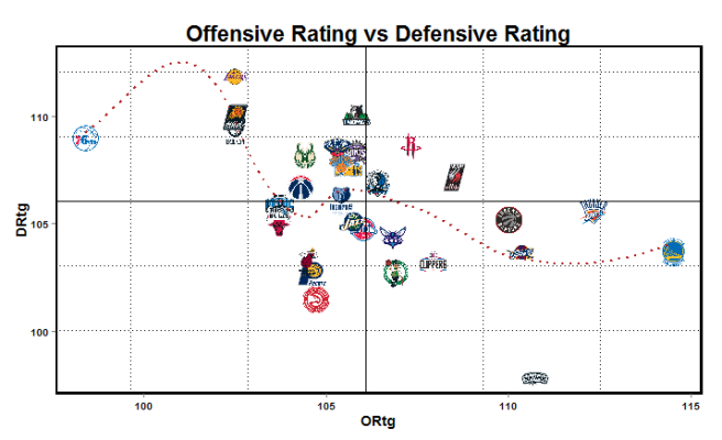
The story line this season has been the Warrior’s pace (and to a lesser extend the Spurs historic season). Offensive/Defensive rating are generally a very good indicator of how good a team is. Below is a simple chart illustrating where teams land on that scale.

The solid lines represent the league average, while the dashed lines represent a standard deviation. It’s worth noting that in most seasons we rarely see teams 2 standard deviations above the average for ORtg/DRtg. This season the Spurs and Warriors are more than 2.5 standard deviations better than the average DRtg and ORtg respectively – something that’s relatively unheard of.
In the post Jordan-era the 2005/07 Suns and 2002 Mavericks were comparable to the 2015 Warriors in that they were ~2.5 standard deviations about the average ORtg. Warriors are the only one of that group to be more than 0.25 standard deviations better than the average defensive rating. The Spurs being 2.5 standard deviations better than the average DRtg is even rarer. The 2014 Pacers were close to 2.5 standard deviations better of defense (albeit 0.75 standard deviations worse than average on offense). The 2008 Celtics were just as good on defense, albeit only ~0.75 standard deviations better on offense.
Also worth noting that the 96 Bulls were almost 2 standard deviations better than average on offense and defense.
The Celtics defensive rating particularly surprised me. The Celtics tend to play at the 3rd fastest pace in the league, and that aesthetically doesn’t mirror the plodding, grind-it-out defensive juggernauts of the past (Gasol Grizzlies, 04 Pistons, etc.).
On the other end of the spectrum the Kings visually seem like a high functioning offense – scoring 106.7 points a game (3rd), but their fast pace of play deceives how average they are defensively .
Pace certainly seems to obscure how good a team is defensively/offensively. In the past decade the best defensive teams (i.e. 2014 Pacers. 2011 Bulls, 2008 Celtics) have been slower paced teams. On the opposite end of the spectrum, the best offensive teams have been faster paced teams (Nash Suns, 2016 Warriors, 2002 Mavericks). While the relationship between pace and elite offense/defense may hold true, on the macro-scale of the NBA it does not seem to be the case. The below chart shows the relationship (or lack thereof) between pace and offensive/defensive rating.
Pace also tends to overvalue the counting stats of older players. Kareem-Abdul Jabbar, for example, won the MVP putting up 27 PPG/14.5 RPG/4.8 APG game in 1973.1974 – stats that would undoubtedly win the MVP in today’s league. However, Kareem’s scoring per 100 possessions (28.1) doesn’t match up to modern-day MVP’s scoring per 100 possessions. In their most recent MVP years Stephen Curry (35.5), Kevin Durant (41.8), LeBron James (37.5.), Derrick Rose (35.6) and Kobe Bryant (36.5) all outscore Kareem per 100 possessions.
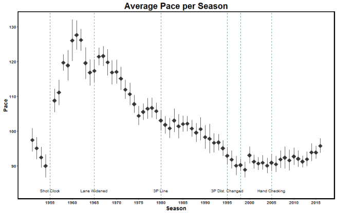
The below charts show how pace has changed throughout history. The error bars represent the standard deviation in that given year. The 73/74 season I mentioned earlier was ~10% faster than the modern NBA. Going back to Wilt’s era of the 60s, the game was nearly 30% faster than it is today. Given that, it’s no surprise Wilt was able to score 50 points a game. Obviously there is some merit that players like Wilt and Kareem were well conditioned enough to play 30% more possessions a game, but the large discrepancy in pace is worth noting when comparing raw numbers across eras.

We’re currently seeing a small up-tick in pace from the all-time low from the early 2000s (discounting the pre-shot clock era). The rule changes also seem have little impact on the pace of the game.
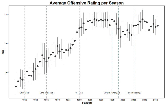
This chart shows how average offensive (and consequently average defensive) rating changed throughout history. Things of note are:
- The lockout years, 1999 and 2012, show a dip in offensive rating.
- Offensive rating jumped up after hand-checking was curtailed
- The 3P line introduction had very little effect on offensive rating

The above charts can be further explored through this interactive Shiny app. The app shows how individual teams ranked across the offensive/defensive rating spectrum in a given year. The tiers are determined by a k‑means clustering algorithm that groups teams with similar offensive/defensive ratings together in an effort to group similar teams in a given year. The app takes a while to pull up (~1 minute) since it’s pulling data for every year off Basketball-Reference every time the app starts up.


